
Button
A button leads further: to another screen, to a window, to a scenario block — for example, to "HTTP request" or "Bot message". Every button is an exit of the screen.
Settings
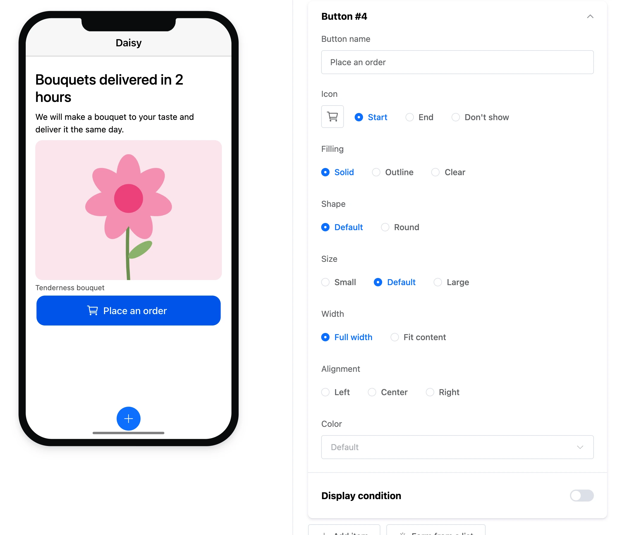
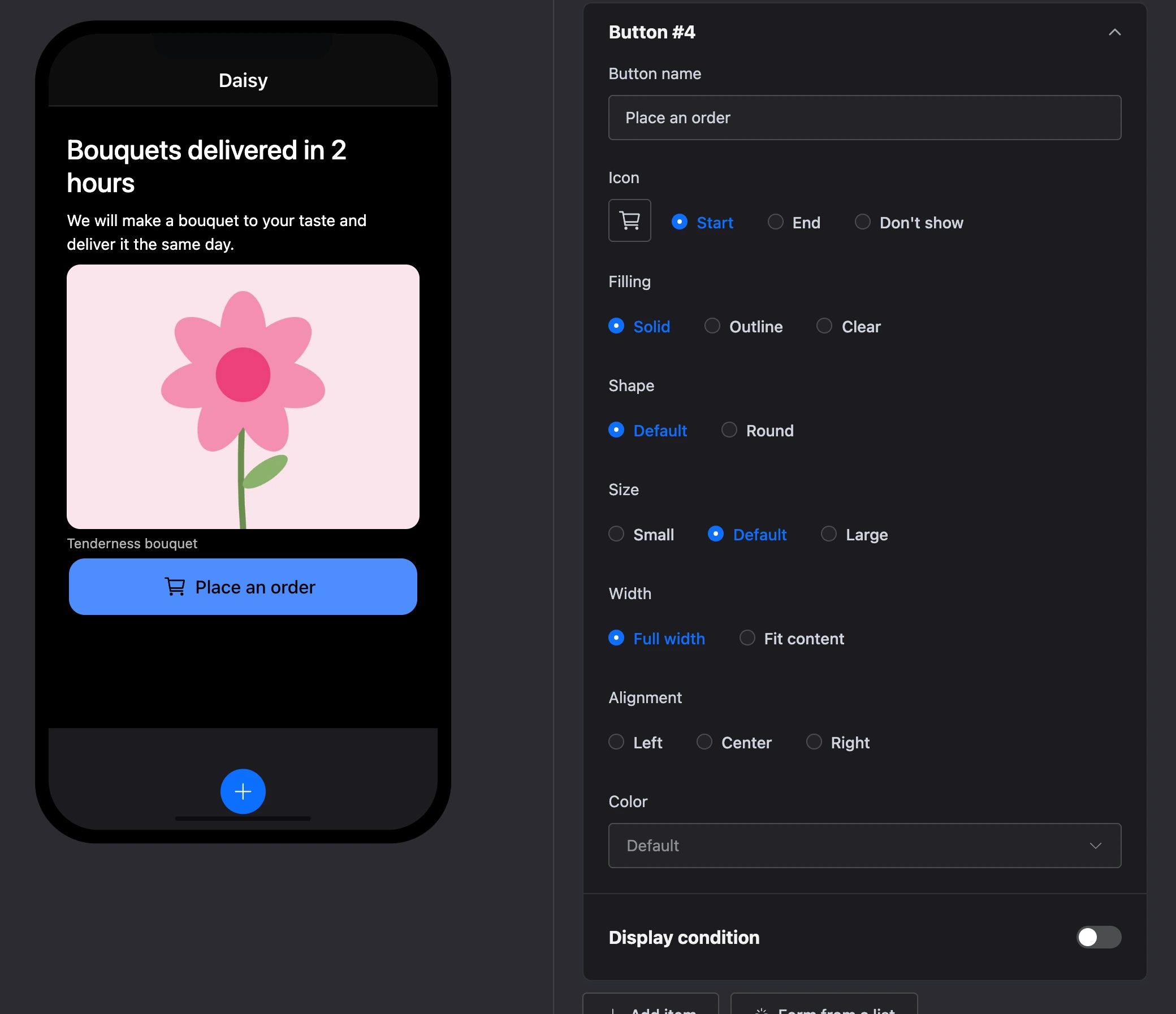
- "Button name" — the label on the button.
- "Icon" — an icon from the set and its place: "Start", "End" or "Don't show".
- "Filling" — "Solid", "Outline" or "Clear".
- "Shape" — "Default" or "Round".
- "Size" — "Small", "Default", "Large".
- "Width" — "Full width" or "Fit content".
- "Alignment" — "Left", "Center", "Right". It is noticeable on a "Fit content" button.
- "Color" — a colour from the app's palette.
Exit
The screen gets the "Button "Name"" exit. If no link is drawn from the exit, a tap does nothing.