

Screen elements
A mini app screen is built from elements: headings and text, buttons, images, input fields, lists, maps and more. Elements sit in the areas of a screen — in the content, in grid columns, inside a card or an accordion section. How a screen and its areas work is on the Builder page.
This page covers how to add elements and what they have in common. What each element does and how to set it up is on the group pages listed at the end.
Add an element
The "Add item" button is in the area's settings, under the list of its elements. In the menu, elements are split into groups: "Basic", "Widgets", "Containers", "Input fields", "Lists", "Shop", "Appointments" and "For specialists". A new element goes to the end of the area, and the order is changed by dragging.
An area holds up to 100 elements.


What all elements have in common
- Collapsed list. In the area's settings, each element is a row with a name like "Button #2". A click on the row expands the element's settings. A click on an element on the phone opens exactly that element.
- Copying. The "Copy" button on an element puts it on the clipboard. You can paste it into any screen: "Paste: …" appears as the first item of the "Add item" menu. Within the same version, the copy keeps the links from its exits.
- Alignment and colour. The heading, text, button, image, rating and countdown have "Alignment": "Left", "Center", "Right". The heading, text, button, divider, card, switch, slider, rating and countdown have a "Color" from the app's palette.


Display condition
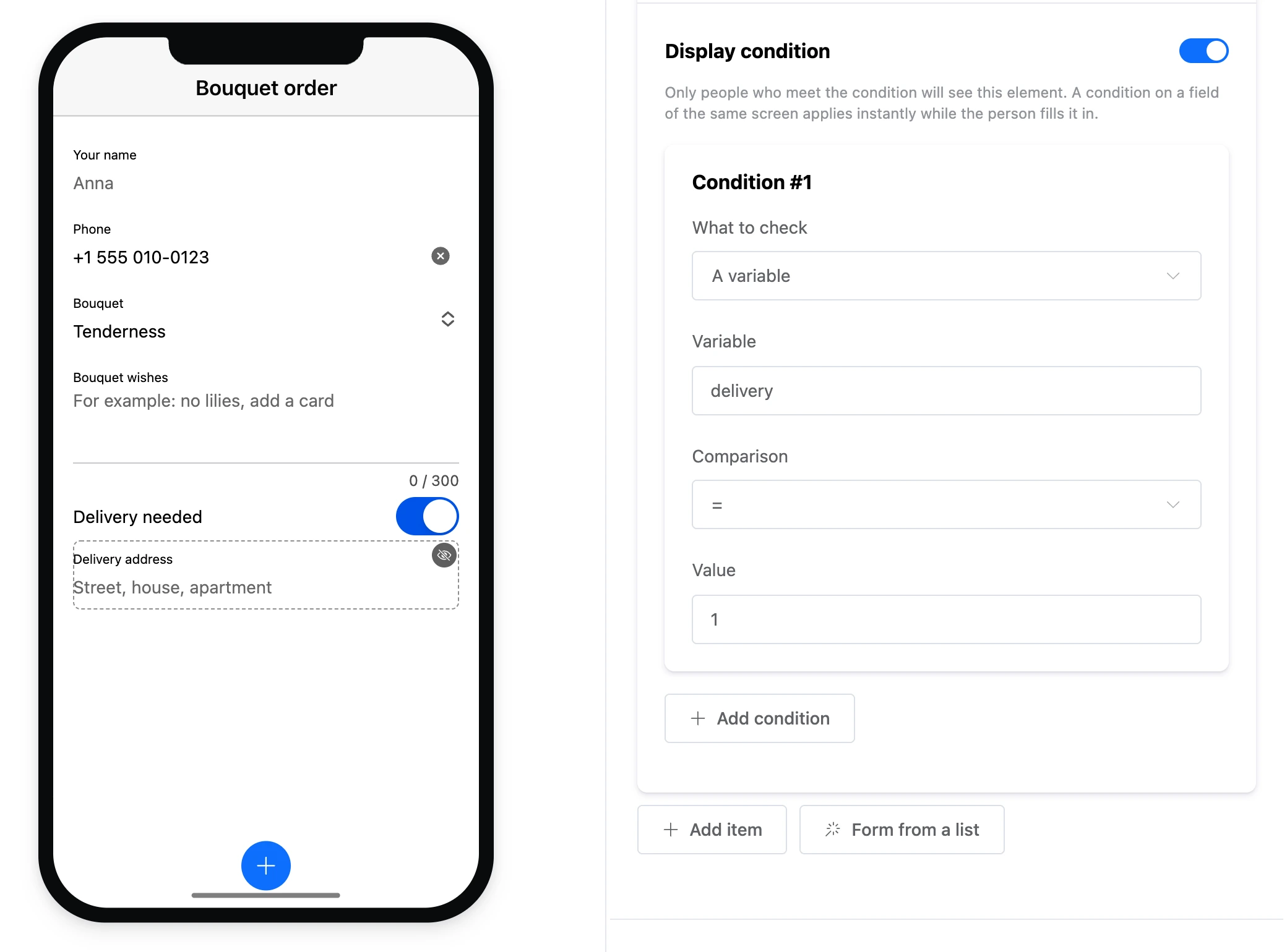
"Display condition" is at the end of the settings of any element, including one nested in a card. Only those who meet the condition see the element. If the condition checks a field of the same screen, the element appears and disappears right away while the person fills in the field. In the builder, such an element has a dashed outline. How conditions are set is on the App data page.

Element exits
Some elements give the screen exits — links lead from them to the next block. An exit appears by itself when the element is added or the right setting is turned on:
| Element | Exit |
|---|---|
| "Button" | Always — "Button "Name"" |
| "Image" | With "Image click is an event" ticked |
| "List" | Each row has one — "Row "Title"" |
| "Card" | With "Card click is an event" ticked. The exits of nested elements also belong to the screen |
| "List records" | With "Tapping a record is an event" ticked |
| "Record card" | With "Follow the link when there is no record" ticked |
| "Record form" | Always — fires after a successful submission |
| "Countdown" | With "Go further" ticked — "Time is up" |
| "HTML code" | The exits you create in the code settings |
The exits of the appointment elements are described on the Appointments page.
Taps on input fields, the countdown and the map do not count as exits.
Element groups
- Basic — heading, text, image, video, button, list and divider.
- Widgets — countdown, map and your own HTML code.
- Containers — card and accordion, which hold other elements.
- Input fields — input, multiline input, select, switch, slider, star rating, date and time.
- Lists — list records, record card and record form.
- Appointments — booking clients with specialists and screens for specialists.
- Files: images and videos — which files can be uploaded to elements.